
Creating a great website takes dedication. It takes time (a whole lot of precious time) not to mention planning and testing and a stack of data analysis. Most of our clients come to us with the primary goal of getting more traffic to their site, but it can actually be way more profitable to focus on selling more effectively to the traffic you already have, than trying to entice a whole new bunch of people (who still might not convert).
So, what if we told you that just by making a few simple design changes you could increase the conversion rate of your current visitors? We’re sure you’d want to hear more – right? So take five …
Be decisive
Choose one call to action. Some website owners think that they should give their customers lots of choice, as if their website were a ‘choose your own adventure’ book. They put a whole lot of different choices all over the place and hope that the customer will find one they like. But giving people too much choice just confuses them. Figure out what you want your customers to do first and then build your page around that one single goal. Don’t put a ‘sign up for our newsletter’ button in between a ‘learn more’ button and a ‘watch this video’ button. Pick ONE and make it happen.
Make it easy
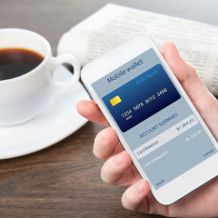
Want them to buy something? Make the shopping cart process as simple as possible. Put the ‘Add to Cart’ buttons right there in the open. Big, bold and beautiful. Make the credit card process a breeze. Add PayPal options so the user doesn’t even have to stop and think about their credit card number. Every time your customer has to stop and think about something, even if it’s to create a compulsory account to make things smoother next time, it’s one more opportunity for them to change their mind about the sale.
Take photos
A picture is worth… well you know how it goes! Here’s the thing though – if you’re in a shop and you’re interested in buying something, the first thing you do is pick it up or turn it over or look inside. Obviously on your website your customers can’t do that, but you can help them out by taking great photos from different angles. The more they see, the more likely they are to form an attachment to the product – and of course – the more likely they are to buy it.
Clear out the junk
Remove all the clutter on your site. Think about the difference between your local dollar store and a boutique clothing shop. The dollar store is crammed full of lots of different products and everything is a haphazard and confusing. In the boutique there’s lots of clean bench tops and white lighting and space to move around and look at things carefully. White space helps you create the feel of a boutique in your website and all that extra space gives your customers an opportunity to focus on what’s really important, instead of getting distracted by the clutter.
Leverage social proof
One of the best ways to get customers to see the value in a product or service is to show them other people who love it. Incorporate product reviews and testimonials into your design to show customers what people loved about your products (and you!). Giveaway freebies in exchange for reviews from influential bloggers or implement an automated follow up email after a customer buys something asking them to review the item. Incorporate membership points, or site discounts for customers who leave lots of good feedback and encourage people to interact (positively!) with your brand on an open forum.